How to Choose Sublimation Shirt Designs for Polyester Tees
Learning how to choose sublimation shirt designs means checking the garment before falling for the artwork. The fabric content, shirt color and available chest area determine which composition makes sense for your project. This guide focuses on direct sublimation onto light polyester tees: how to compare the blank’s label, choose a readable print, calculate the pixels you need and plan a separate placement for each shirt size.
Quick Answer
- For direct sublimation, start with a light tee whose polyester content and manufacturer guidance suit your ink and transfer process.
- Treat a polyester blend as its own material choice. Do not assume it will produce the same appearance as a 100% polyester garment.
- Choose the print width from the actual shirt’s usable chest area, and preserve the artwork’s proportions when calculating its height.
- Check native pixel dimensions at the physical print size you intend; a resolution label alone does not establish usable detail.
- Print an actual-size paper layout, check its position on the shirt and follow the blank supplier’s settings for the transfer.
In this guide:
- Read the Fabric Label Before Choosing the Design
- Choose the Shirt Color With the Illustration in View
- Match the Composition to the Wearer and Placement
- Measure the Actual Tee Instead of Copying a Universal Width
- Choose Enough Source Pixels for the Planned Chest Print
- Check the Layout on Each Shirt Before Preparing Transfers
- Checklist Before Choosing the Shirt Artwork
- Frequently Asked Questions
Read the Fabric Label Before Choosing the Design
Start with the shirt’s composition and the instructions for your ink system. Traditional direct dye sublimation is associated with polyester fabrics; the garment’s plain appearance does not tell you whether it is suitable. A white cotton tee can look like the blank in a mockup while requiring a different transfer method.
For a straightforward polyester project, compare shirts intended for sublimation and read their actual labels. Manufacturer compatibility lists can include specific polyester blends as well as 100% polyester, but the blend should be considered separately rather than treated as an identical replacement. A softer or more muted result may suit a vintage-style composition, while a bold illustration calls for a blank and workflow that support the intended appearance.
| Garment choice | What to establish | Effect on the artwork decision |
|---|---|---|
| 100% polyester, light color | Supplier suitability for your ink, paper and pressing process | Useful starting point for a clear, colorful design |
| Polyester blend | Exact fiber percentages and supported workflow | Consider the intended appearance rather than expecting an identical result |
| Cotton or a dark garment | A compatible alternative transfer system or prepared surface | Reassess the process before selecting direct-sublimation artwork |
If you use a special transfer material or an ink system designed for another fabric, follow that system’s complete workflow. Do not carry over assumptions about paper, fabric or pressing from a direct polyester project simply because the file is labeled sublimation.
Choose the Shirt Color With the Illustration in View
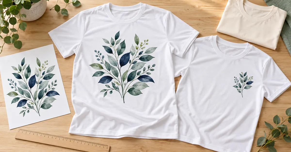
A light blank gives you a useful starting point for judging colorful artwork, but light colors are not all visually interchangeable. Compare the actual tee with the illustration’s pale areas and edges. A cream shirt can give a different overall impression from a bright white one, especially around watercolor washes or light floral details.
Transparent parts of the design leave the garment visible, so think about the whole composition against that base. A dark outline may stay easy to recognize where a very pale detail is harder to distinguish. When the intended look depends on a crisp light background, check the printing system’s capabilities and garment recommendation before selecting a darker shirt.
The colorful everyday shirt designs include both lettering and illustrated artwork. Compare the quiet spaces, pale elements and surrounding garment color for each option. A digital mockup helps communicate a style, but it is not evidence that your particular shirt and printing setup will reproduce the same color.
Match the Composition to the Wearer and Placement
Choose one main visual purpose: a large illustration, a short readable phrase or a small chest motif. A tall animal graphic, a wide sunset and several lines of lettering occupy the chest differently. Use the wearer and occasion to narrow the style before deciding the final print width.
For text, read every phrase and check the smallest line. Decorative script can become difficult to read when a design is reduced for a child’s tee or a compact left-chest placement. The funny shirt designs are useful for comparing sayings, but the joke should suit the person as well as fit the shirt.
Avoid forcing a full wrap, square collage or very wide composition into a narrow area by stretching it. Choose another arrangement, preserve open space or crop intentionally without cutting the message. For coordinated shirts, relate the art through its palette or theme while checking each recipient’s garment separately; matching does not require identical physical print dimensions.
Measure the Actual Tee Instead of Copying a Universal Width
Lay the shirt flat and identify the usable chest area between the seams, away from the neckline and any pocket or other obstruction. Measure the available width and decide where the motif should sit on this garment. Adult and child tees, fitted cuts and loose cuts can offer different spaces even when their size labels look familiar.
Use a paper rectangle or silhouette to compare candidate sizes. For an illustration with a 4:5 aspect ratio, an 8-inch width produces a 10-inch height. At 6 inches wide, the same proportional design is 7.5 inches tall. These are examples for visual planning, not standard recommendations for every chest.
Check the top and bottom of the composition as well as its width. A tall print may fit between the side seams but extend lower than intended. Do not set its position from the neckline alone without looking at the whole shape. For a paired outfit, the matching couple shirt sets offer coordinated messages to compare against two separately measured tees.
Choose Enough Source Pixels for the Planned Chest Print
Once you have the physical placement, check the raster image’s pixel dimensions. At a target of 300 pixels per inch, an 8 × 10 inch layout requires 2400 × 3000 pixels. A 10 × 12 inch layout requires 3000 × 3600 pixels. Calculate both sides using the requirements of your actual printing workflow, and include any final crop in the check.
Changing a small image’s resolution value to 300 does not supply the original detail needed for a larger chest print. Upsampling estimates additional pixels. If tiny lettering or a character’s face is already unclear in the source, choose a better original or a smaller usable placement rather than relying on a metadata change.
Read the delivered-file list too. A PNG may offer a convenient finished illustration, while a vector file can be useful for genuinely editable elements. Confirm how any name or phrase can be changed. The custom tee artwork ideas provide dimensions or format information to compare with your proposed print, instead of judging suitability by the mockup’s size.
Check the Layout on Each Shirt Before Preparing Transfers
A final-size paper layout makes the placement easier to judge on the actual garment. It can reveal a print that feels too low, lettering that is too small or a motif that nearly reaches the seams. Use it to inspect composition and measurements; ordinary paper output is not a reliable forecast of transferred color.
- Confirm the exact shirt’s fabric content, color and suitability for the intended ink and transfer workflow.
- Measure its usable chest area and choose a composition with an appropriate aspect ratio.
- Set the layout’s physical width and height, check source pixels and keep any name or text edits accurate.
- Print a paper proof at actual size with automatic scaling disabled. Measure it rather than relying on the print dialog alone.
- Place the proof on the laid-flat tee and inspect the complete motif against the neckline, seams and garment proportions.
- Repeat the placement check for every size in a coordinated set. Then prepare each transfer using the blank supplier’s printing, pressing and cooling instructions.
Save each final placement with a clear garment reference. This helps prevent a layout approved for one tee from being used accidentally on another size. Any mirroring should follow the transfer workflow and be applied at the correct stage so the artwork is not mirrored twice.
Checklist Before Choosing the Shirt Artwork
- The garment’s actual polyester content is known.
- The blank, ink and transfer method are compatible.
- The shirt color suits the intended artwork and process.
- The style and wording fit the wearer and occasion.
- The composition fits the measured chest area with its proportions preserved.
- Source pixel dimensions support the chosen print width and height.
- Required name or phrase edits are supported by the supplied file.
- A final-size paper proof has been checked on each garment size.
- Transfer settings come from the relevant blank or process supplier.
Find Designs for Your Project
Compare the composition and file details after settling the garment and placement.
- Artwork ideas for colorful custom tees — compare illustration shapes and supplied pixel dimensions
- Everyday apparel designs — look at both complete graphics and lettering-led layouts
- Funny shirt sayings — choose wording that suits the wearer and remains readable
- Kids’ school-party shirt artwork — check each motif against a smaller garment’s usable print area
Frequently Asked Questions
Can I directly sublimate the same design onto a cotton tee?
Do not assume a direct polyester workflow will work on ordinary cotton. Confirm a compatible alternative ink or transfer system and its full instructions before choosing the garment or preparing the file.
What is the correct print width for every adult tee?
There is no single width that fits every cut and composition. Measure the actual garment’s usable chest area, preserve the artwork’s proportions and judge an actual-size paper proof on that shirt.
Can adult and child shirts use the same final layout?
They can share artwork, but each garment needs a size and placement check. Smaller shirts may require a simpler composition or different lettering layout rather than just a reduced adult print.
Does a paper proof show the final sublimation color?
It helps you check dimensions, placement and readability. The final color depends on the garment and printing process, so follow the relevant supplier’s workflow rather than treating the paper layout as a color guarantee.
Let the Garment Guide the Artwork Choice
Settle the material, base color and usable print area before choosing the final graphic. A correctly proportioned design with adequate pixels and readable details gives you a clearer starting point than an attractive mockup alone.